$ 34.99
Each Creative Action Network poster is hand-printed and handled to make sure that only the highest quality is offered and sent out. The sturdy matte paper and premium inks create a vibrant, museum-quality image that looks great both framed and unframed. Posters are printed in Los Angeles, CA on Epson Enhanced Matte Paper heavyweight stock, with a wide color gamut and Epson UltraChrome HDR ink-jet technology. The framed poster arrives wrapped in a protective yet lightweight black frame and includes a shatter-resistant acrylite front protector that won't break during shipping. International orders may be subject to customs duties & taxes.
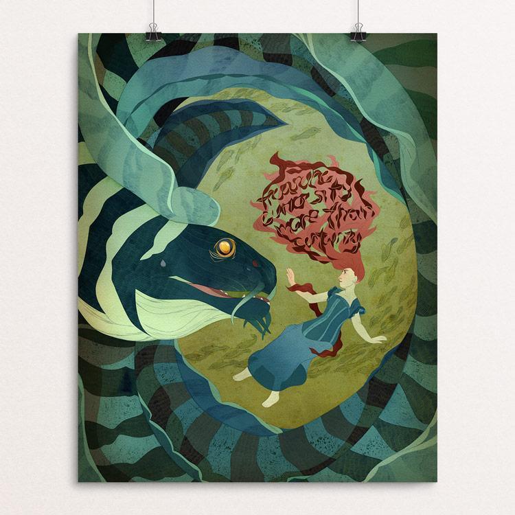
The first 6 months of posters have been lovely, and it's always a treat when the new one gets released. The shifting palettes, styles and content inspired me to try and add something new to the series; my quote was "Treasure curiosity more than caution". Cha-ching. Curiosity is one of the most basic parts of the creative process. Whether exploring media or ideas, or trying something totally unrelated only to find that you can bring that back to your artwork, the drive to find or create something new keeps artists working. The only guy who treasures caution is Diego de la Vega. Zorro loves curiosity. Also, I've been watching kind of a lot of Zorro. I tend to work smaller than the proscribed 13'' x 17'', and I like painting character-based pieces, so this was a chance to play with a larger scale of contrast between the actors. This piece was also unusual for me because I almost never create color keys, but it was relaxing to have all those decisions made ahead of time. I used my standard process; first I complete a full-color, high-value watercolor painting on Arches 140lb cold press. I scan it and work digitally and color everything again. Using the text as part as the environment, as art directors Robyn and Greg urged, helps make this part of their relationship instead of just the line of a moment. This piece was more conceptual than my usual, purely narrative work. You should probably be cautious of some eels, though. The badly brought-up ones. — Lia Marcoux
